
How do you add pizzazz to your living spaces with daring and eye-catching hues? In this blog post, we provide you with ‘a guide to decorating your home with bold colors‘ to achieve just that!
If you’re looking to add some excitement and personality to your living spaces, you’ve come to the right place. In this post, we’ll be exploring the world of bold color and how you can use it to create a space that reflects your style and mood.
Decorating with bold colors can be a fun and rewarding experience, but it can also be a bit daunting. With so many options to choose from, it can be tough to know where to start. But don’t worry, we’re here to guide you through the process and help you create a colorful and dynamic space that you’ll love spending time in.
From considering the mood you want to create with your decor, to starting small with a few pops of color, to combining bold hues for maximum impact, we’ll cover all the tips and tricks you need to know. We’ll also delve into the 60/30/10 rule and offer a general rule for using bright, strong colors.
Plus, we’ll give you the lowdown on the best colors that go together, what colors are considered bold, and the most bold color of them all.
A Guide to Decorating Your Home with Bold Colors
Whether you’re looking to create a warm and inviting atmosphere or a more energetic and lively vibe, bold colors are the way to go. So, let’s dive in and get started on your bold color adventure!
Bold Colors Defined
So, what exactly are bold colors? Well, it’s subjective, but generally speaking, bold colors are rich, intense hues that command attention. They’re not for the faint of heart and can be a bit intimidating, but used in the right way, they can add a lot of character and drama to a space.
Bold colors can be anything from bright reds and yellows to rich jewel tones like emerald green or sapphire blue. The key is that they stand out and make a statement.
When it comes to the most bold color, it really depends on personal preference. Some may say that a bright, fire-engine red is the boldest, while others might argue that a deep, inky blue takes the cake. It’s all up to interpretation.
One thing’s for sure, though: using bold colors in your decorating requires a bit of courage and a willingness to take a risk. But the end result can be a truly stunning and unique space that reflects your personal style.
General Rule for Using Bright Strong Colors
When it comes to using bright, strong colors in a space, there’s a general rule to keep in mind: less is more. This means that it’s best to use bold colors sparingly, as too much of a bright color can be overwhelming.
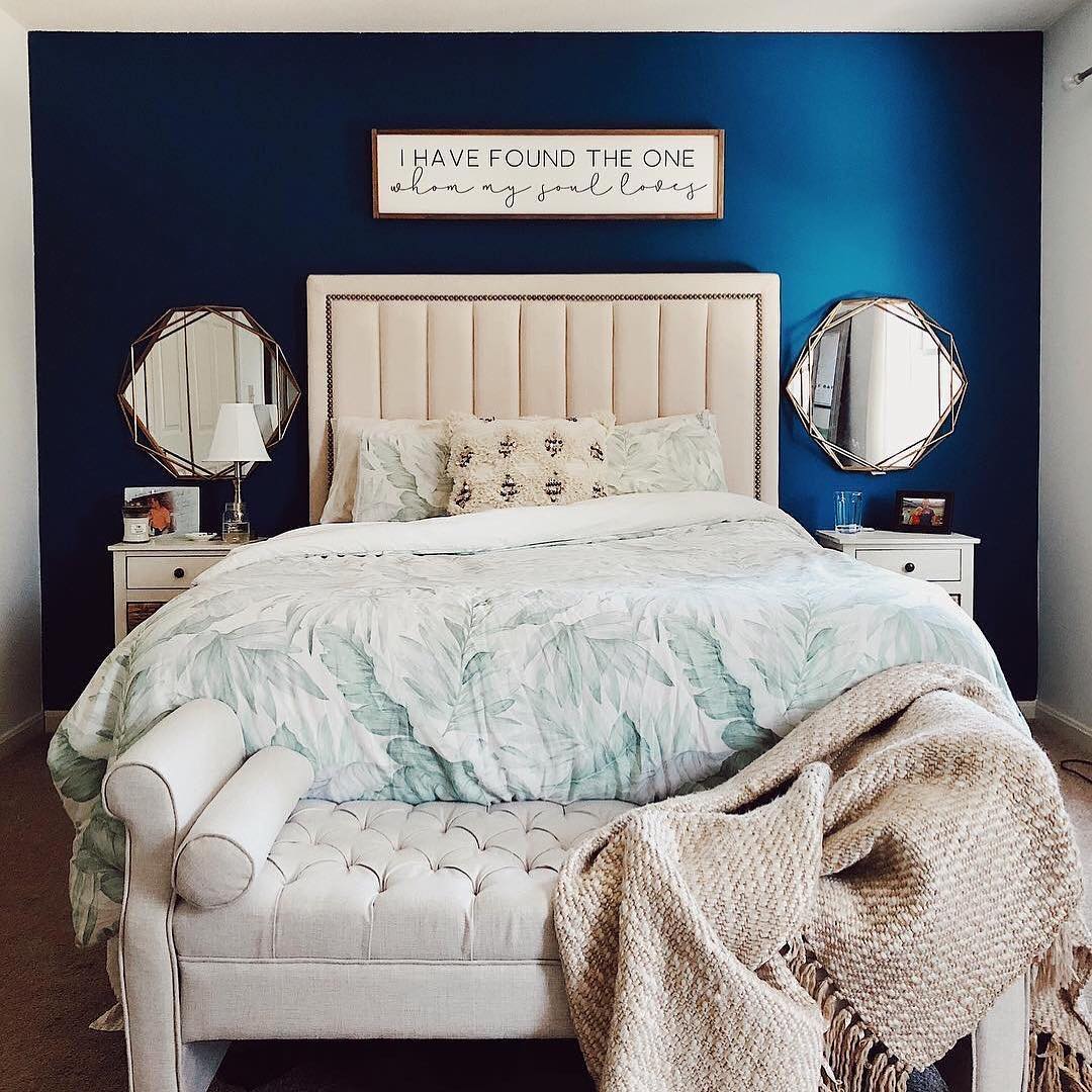
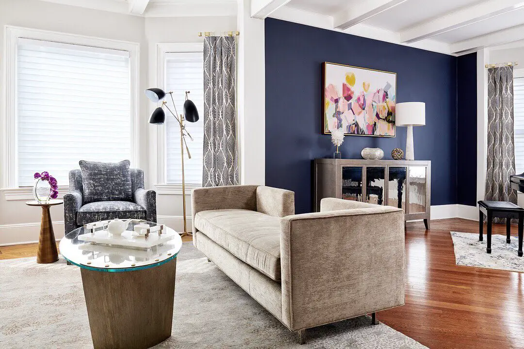
Here’s a simple way to think about it: choose one bold color as the main focus of the room and use it on one large surface, like an accent wall. Then, add pops of the same color throughout the room in smaller amounts, like in throw pillows or a piece of artwork. This creates a cohesive look and ensures that the bold color doesn’t take over the entire space.
Another option is to use bold colors in a patterned fabric or wallpaper. This way, the bright colors are still present, but they’re broken up and not as intense.
The key is to find a balance between using bold colors to make a statement and using them in moderation so that the space feels cohesive and not overwhelming.
The Best Colors That Go Together
When it comes to decorating with bold colors, it can be helpful to know which colors work well together. After all, you want to create a space that’s visually appealing and harmonious.
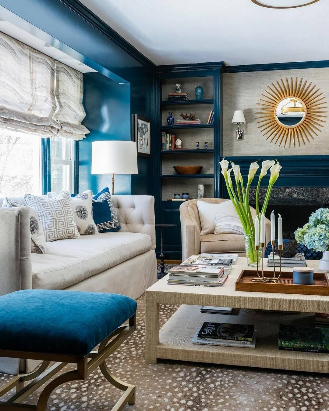
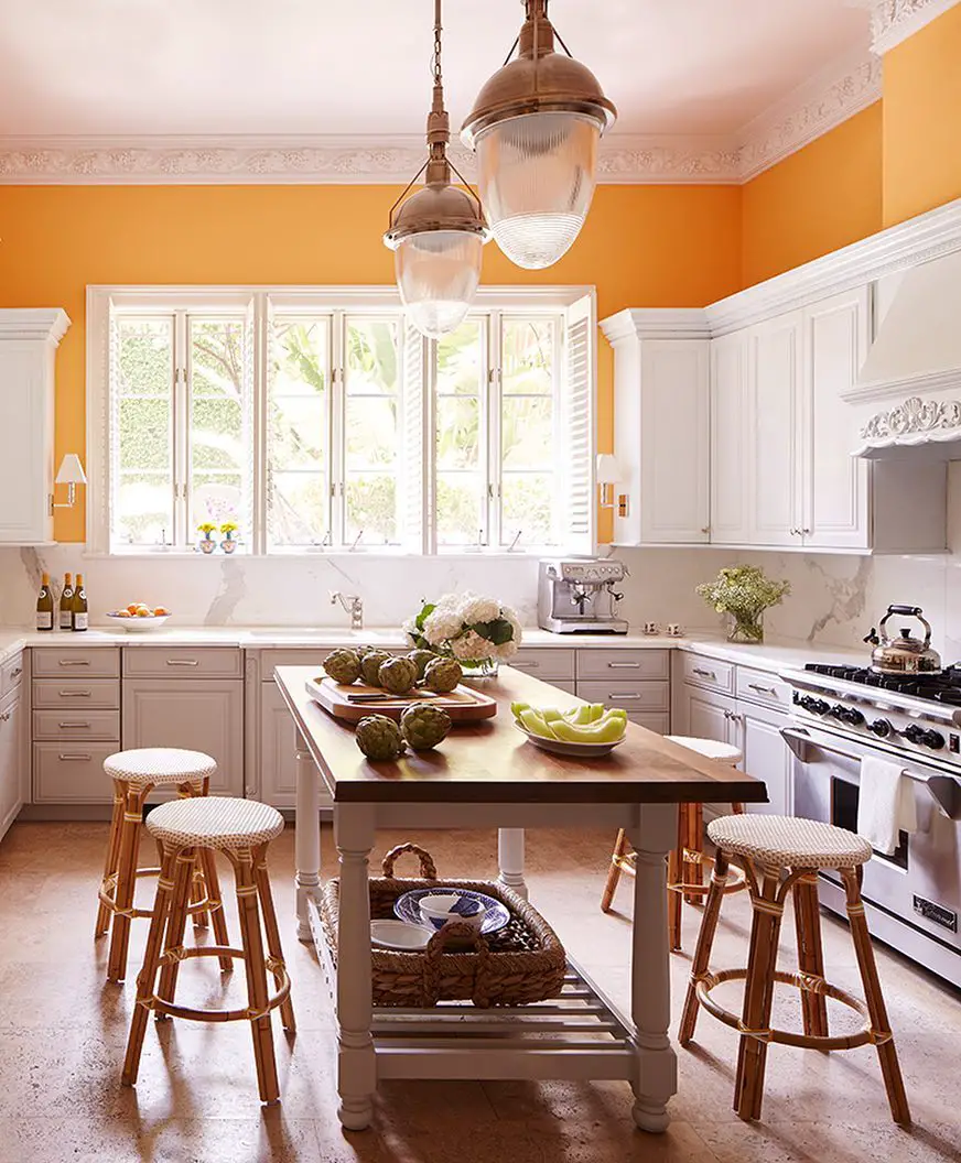
The three best colors that go together are blue, green, and orange. These colors are complementary, which means that they sit opposite each other on the color wheel. This creates a balanced and harmonious look, as the colors bring out the best in each other.
For example, you could paint a room in a blue hue and then add pops of green and orange throughout the space, like in throw pillows or a piece of artwork. Or, you could choose a bold green wall and then bring in blue and orange accents. The possibilities are endless!
These three colors are versatile and can work in a variety of settings, whether you’re going for a coastal, bohemian, or modern look. And because they’re complementary, they’re always a safe bet when you’re unsure of which colors to use together.
Consider the Mood
When it comes to decorating with bold colors, it’s important to consider the mood you want to create. Different colors can evoke different emotions and moods, and it’s crucial to choose colors that reflect the feel you want to achieve in your space.
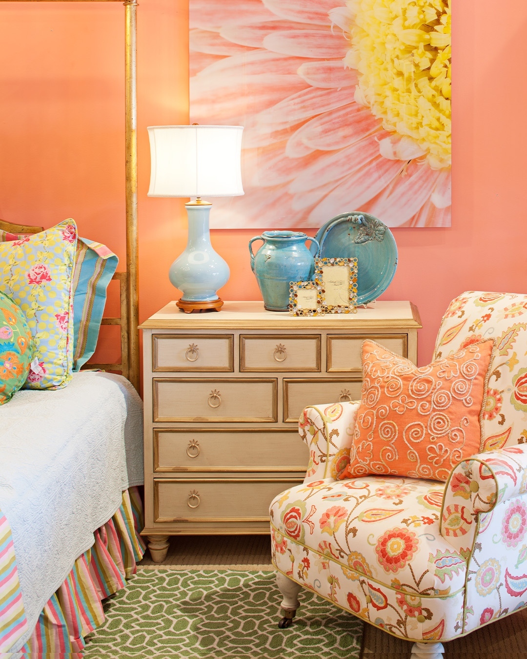
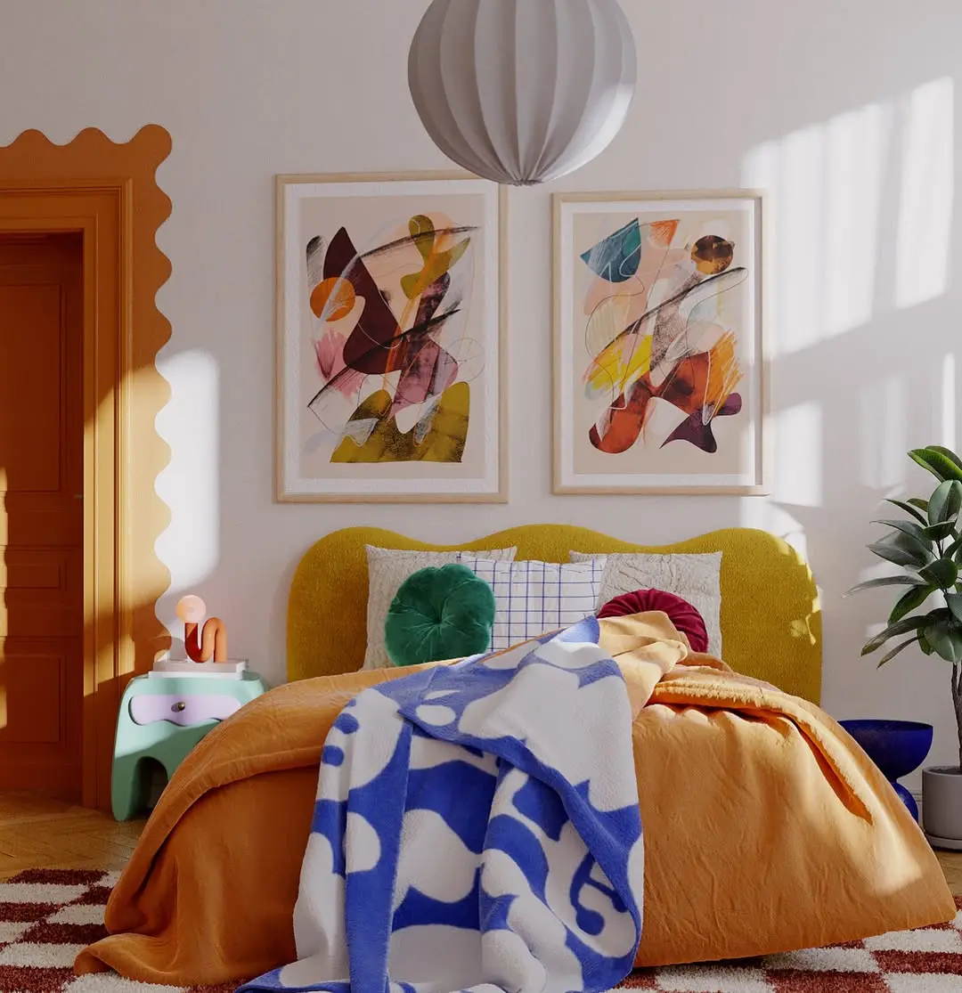
For example, if you’re looking to create a warm and inviting atmosphere, consider incorporating shades of red, orange, and yellow. These colors are known to evoke feelings of warmth, comfort, and coziness, making them perfect for spaces like living rooms and bedrooms.
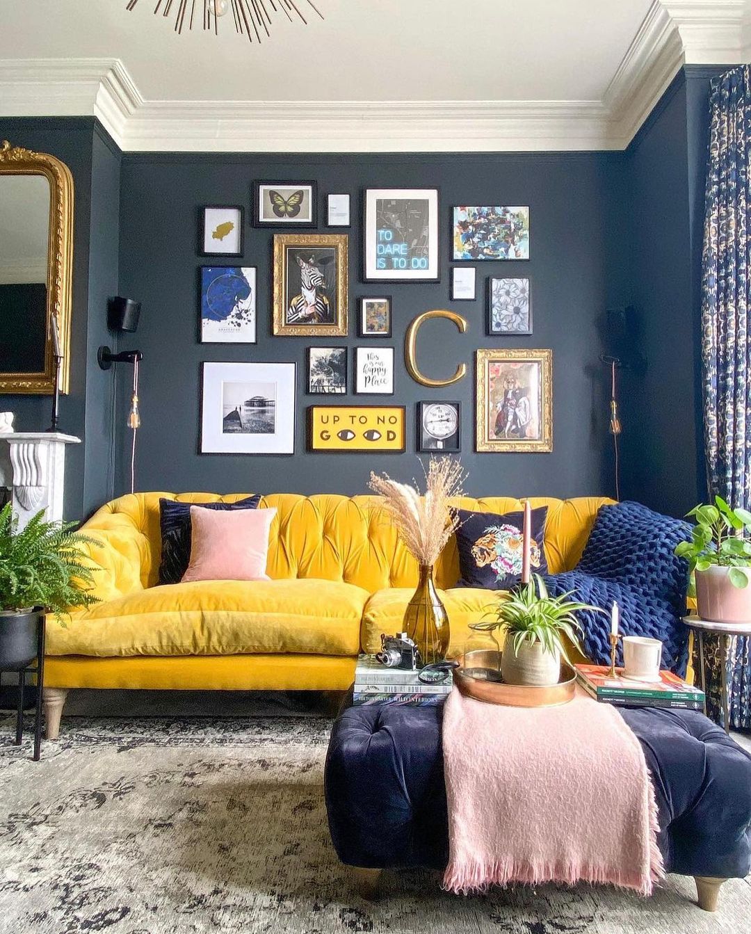
On the other hand, if you’re looking to create a more energetic and lively vibe, consider incorporating shades of green, blue, and purple. These colors are known to evoke feelings of calmness, creativity, and excitement, making them perfect for spaces like home offices, playrooms, and kitchens.
It’s also worth mentioning that colors can have different effects on people depending on their cultural background, personal experiences, and individual preferences. So, when choosing colors for your space, consider the emotions you want to evoke and choose colors that resonate with you and your family.
Start Small When Decorating Your Home with Bold Colors
If you’re new to decorating with bold colors, it can be tempting to go all out and paint every wall in the room with a vivid hue. But, it’s often best to start small and gradually incorporate bold colors into your space.
Starting small allows you to experiment with different colors and see how they work in your space without committing to a major renovation. Plus, if you find that you don’t love the color as much as you thought you would, it’s much easier (and less expensive) to make changes when you’ve only incorporated a small amount of color.
Here are a few ways to start small when incorporating bold colors into your space:
- Accent walls: An accent wall is a great way to add a pop of color to a room without overwhelming the space. Choose a wall that you want to highlight and paint it with a bold color. This will give the room a focal point and create a sense of depth.
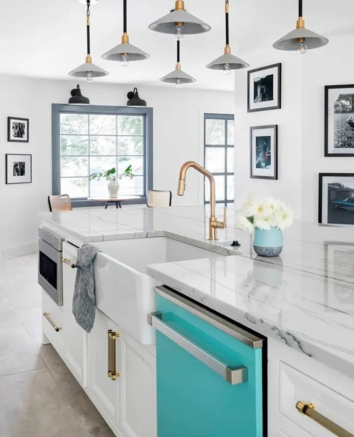
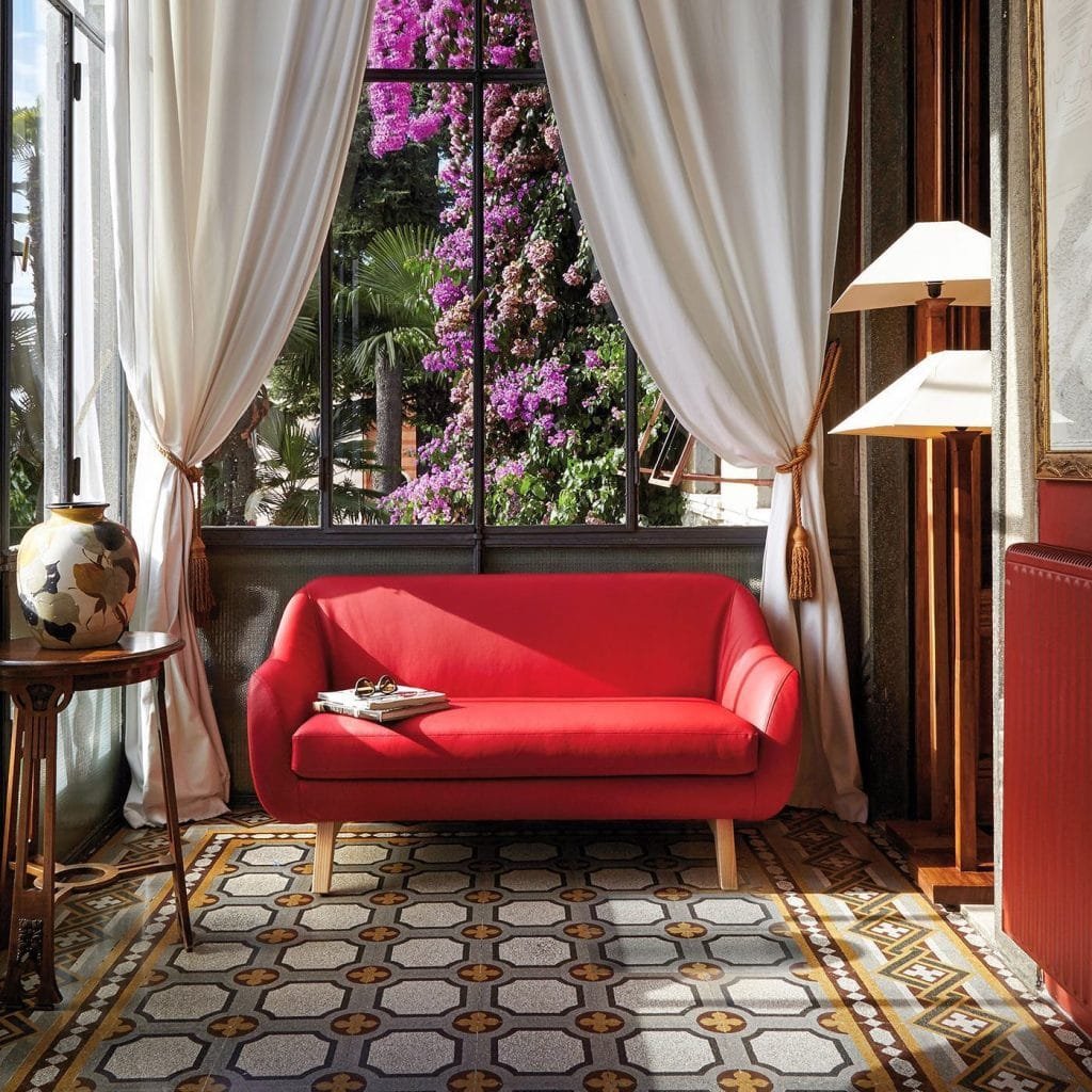
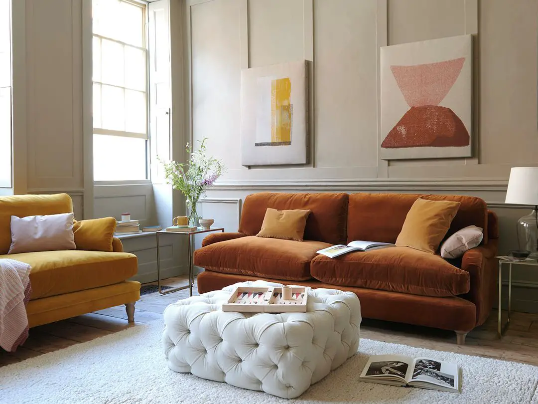
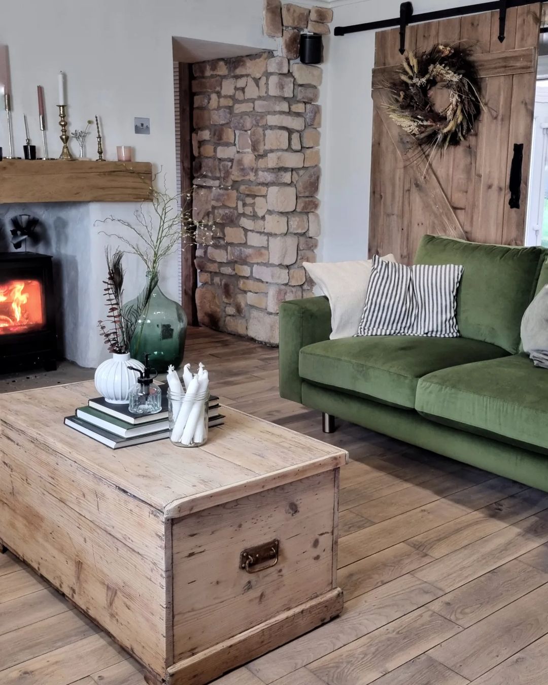
- Brightly colored furniture or accessories: Furniture and accessories are a great way to add color to a room without making a permanent change. Consider investing in a brightly colored sofa, armchair, or rug. These pieces will instantly brighten up the space and provide a focal point for the room.
- Textiles: Textiles are another great way to add color to a space without making a permanent change. Consider adding colorful throw pillows, curtains, or a colorful piece of art. These small touches will add personality and color to the room without being too overwhelming.
Starting small is a great way to get your feet wet when decorating with bold colors. It allows you to experiment with different colors and see what works best for your space. So, take your time, have fun, and enjoy the process of bringing bold color into your home.
Choosing the Right Shades
When it comes to choosing bold colors for your space, it’s important to consider the natural light in the room. The amount of natural light that a room receives can greatly affect the way a color appears, and it’s crucial to choose shades that complement the light in the space.
For example, if a room receives a lot of natural light, you can afford to choose bolder, brighter shades. These shades will look vibrant and cheerful in the bright light. On the other hand, if a room receives less natural light, it’s best to choose softer, more muted shades. These shades will look cozy and inviting in the more subdued light.

Another tip for choosing the right shades is to test out the colors before committing to a full room. You can do this by painting small swatches of color on the wall and observing how they look in different lighting conditions throughout the day. This will give you a good idea of how the color will look in the space and help you make an informed decision.
It’s also worth mentioning that color can look different on different surfaces, so it’s a good idea to test the color on the same type of surface you plan to paint. For example, if you’re painting a wall, test the color on a piece of drywall or poster board. If you’re painting furniture, test the color on a piece of cardboard or a spare piece of wood.
Mix and Match
When it comes to decorating with bold colors, don’t be afraid to mix and match different shades. In fact, combining bold colors can add depth and interest to a space and create a truly unique look.
One way to mix and match bold colors is by choosing complementary colors. Complementary colors are colors that are opposite each other on the color wheel and work well together. For example, blue and orange, red and green, or purple and yellow. When you use complementary colors together in a room, they create a balanced, harmonious look.
Another tip for mixing and matching bold colors is to use them in equal parts throughout the room. This means that each color should have a similar presence in the space, whether it’s through furniture, textiles, or accessories. This will ensure that the colors are well-balanced and don’t overpower each other.
Finally, don’t be afraid to mix patterns and textures along with the colors. Combining different patterns and textures can add depth and interest to a space and create a layered look that feels inviting and cozy.
The 60/30/10 Rule to Decorating Your Home with Bold Colors
The 60/30/10 rule is a helpful tool for designing with bold colors. This rule states that you should divide a room’s color palette into 60% of a dominant color, 30% of a secondary color, and 10% of an accent color. This creates a balanced look and helps ensure that the bold colors in the room don’t overpower each other.
For example, if you choose blue as your dominant color, you could choose orange as your secondary color, and green as your accent color. This color palette would be used throughout the room in equal parts, with the dominant color covering 60% of the space, the secondary color covering 30%, and the accent color covering 10%.
The 60/30/10 rule is a great starting point for anyone who’s new to decorating with bold colors. It gives you a clear structure to work with and ensures that the bold colors in the room are well-balanced and harmonious.
That being said, the 60/30/10 rule is just a guideline, and you’re free to adapt it to your own personal style. If you prefer a more muted color palette, you can choose softer shades of the dominant, secondary, and accent colors. If you prefer a more vibrant look, you can choose brighter shades. The key is to have fun with it and let your creativity guide you.
The 80/20 Rule
The 80/20 rule in decorating is a simple yet effective way to incorporate bold colors into your space without overwhelming it. The rule states that 80% of a room should be in a neutral color, while 20% should be the accent color.
For example, if you have a neutral living room with beige walls, you might choose to incorporate a bold, bright red sofa as your accent piece. The red sofa would make a statement, but because the rest of the room is neutral, it won’t overpower the space.
The 80/20 rule can be applied in a variety of ways, from choosing bold statement pieces of furniture to incorporating accent walls or textiles. The key is to make sure that the bold accent color doesn’t take over the room and that there’s still a balance between neutral and accent hues.
What to Avoid When Decorating
When it comes to decorating with bold colors, it’s important to keep in mind what to avoid. Here are some common mistakes to watch out for:
- Overloading a room with too many bold colors. It’s important to remember that less is often more when it comes to decorating with bold hues. Choose one or two bold colors to incorporate into a space and avoid overwhelming the room with too many bold accents.
- Ignoring the natural light in a room. The natural light in a room can have a huge impact on how colors appear, so it’s important to consider this when choosing bold hues. For example, a bright yellow wall might look great in a sun-drenched room but might seem overpowering in a room with little natural light.
- Not considering the overall design style of a room. When incorporating bold colors into a space, it’s important to make sure that the colors you choose are in keeping with the overall design style of the room. For example, bright neon colors might work well in a contemporary space, but might seem out of place in a more traditional setting.
- Not testing colors before committing to them. Before choosing bold colors for a space, it’s important to test them out to see how they look and feel in the room. You can do this by painting a small section of wall, or by bringing in a bold-colored accessory to see how it works with the rest of the room.
Conclusion
We hope you found our guide on decorating your home with bold colors helpful.
In this guide, we’ve explored the exciting world of decorating with bold colors. From considering the mood you want to create, to starting small and choosing the right shades, to following the 60/30/10 rule and avoiding common decorating pitfalls, we’ve covered all the essentials of decorating with bold hues.
So now it’s your turn! We encourage you to embrace bold colors in your own home decorating projects. Whether you choose to add a pop of color with brightly colored furniture, textiles, or accessories, or go all-out with a bold accent wall, decorating with bold colors can be a fun and transformative experience.
That sums up our guide on decorating your home with bold colors. Go ahead and experiment with bold colors in your own space.
The possibilities are endless, and the results can be truly stunning!
Happy decorating!
Save this pin for inspiring your bold color decor project!
Related Posts:
- 10 Funky Decor Ideas That Will Bring Your Home to Life
- Mixing and Matching Textures, Colors, and Patterns with Boho Decor
- How to Choose the Right Color Palette for Your Eclectic Home
- Summer Colors: How to Incorporate Bright Hues into Your Home Decor
- Front Porch Ideas for a Cool & Colorful Fall Decor
- Maximalist Decor: How to Balance Eclectic and Overwhelming
- Colorful and Eclectic: How to Create a Boho Maximalist Bedroom
- Beyond Color: Unconventional Techniques for Uplifting Your Home’s Vibe
- How to Style Your Maximalist Home with Colorful Pillows